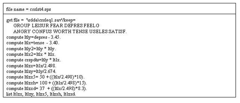
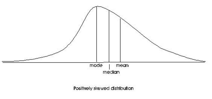
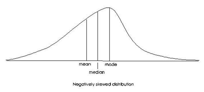
Different Numbers and Stuff
Topics of this chapter
are: Curve Fitting, Curvilinearity, Normal Curve, and
Skewness
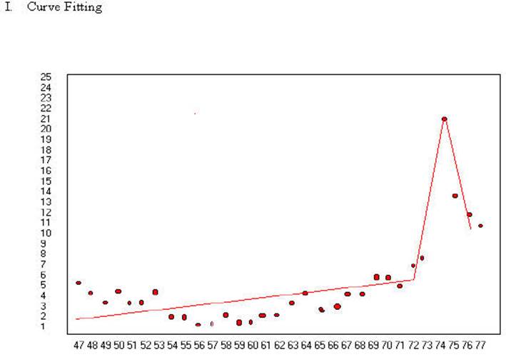
Divorce rates in
Australia in years from 1947 to 1977. In 1974 divorce became legal. The above
lines seem to capture the relationship of divorce rates over time and also the
change in the law in 1974 when divorce became legal. There was a clear spike
when the law changed and a decline after the "pent up" divorces were
accomplished. The lines as drawn seem to pass very close to all of the points.
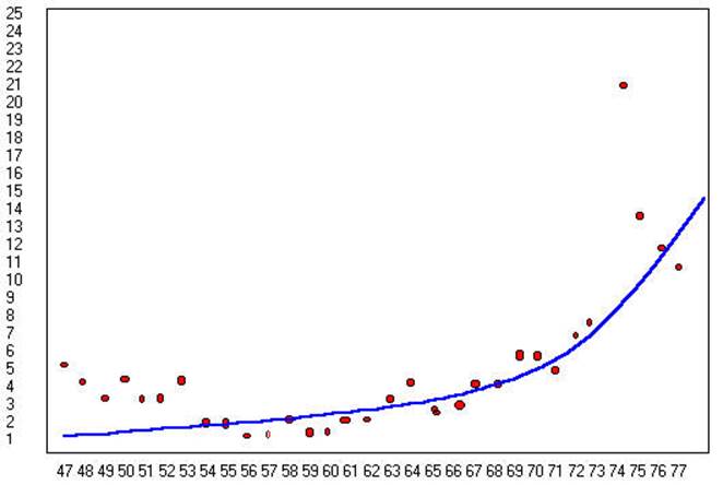
The curve in the second
graph presents a different interpretation. It indicates that the divorce rate
has been on the rise since the middle sixties and possibly the law caught up
with the practice. Further, the line may pass about as close to the data points
as the above graph. The lower line is also more simple.
It could be generated with three functions (starting point, slope and
accelerating) while it may take as many as six functions to generate the top
graph. The bottom graph is more parsimonious.
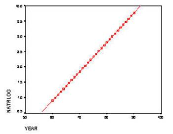
As indicated in the
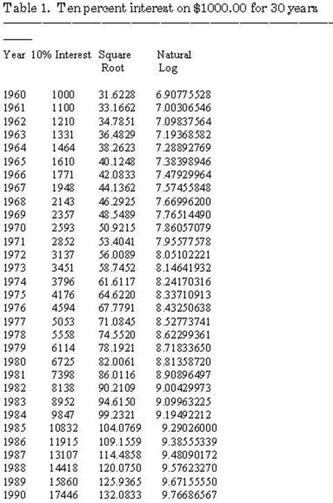
graphs above trends may be linear or non-linear. The data in Table I is
hypothetical trend for 10% interest on $1000.00 for 30 years. Figure 1 shows
the 10% Interest at 5 year intervals. Note the non-linear trend. When the
numbers are squared the trend becomes more linear but it still remains
non-linear in Figure 2. When the natural log is used to transform the data it
becomes linear. This difference can be tested by using multiple regression and correcting skewed data.
Figure
1. 10%
Interest.
The 10% Interest
produces a positive accelerating curve as seen in Figure 1. Notice the each
year the gap widens between the amount of change.
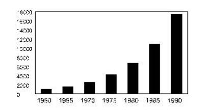
The square root of the
10% Interest reduces the amount of acceleration of the curve but it still
exists. There continues to be a positive accelerating curve.
Notice in both Figures 1
& 2 that the trend is a positively accelerating even though it is less so
in Figure 2 where the transformation is accomplished by the square root method.
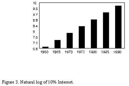
However, in Figure 3 the trend is a straight line (linear). In Figure 3 the
natural log is computed and the result is a straight line.
Things that grow throughout their life will follow that same non-linear pattern
as inflation. For example many organisms like trees and whales do, and their
weight will increase in a non-linear fashion. Many other living things will
increase in a non-linear fashion until maturity. Many psychological phenomenon will follow the same pattern. The year from 1
year old to 2 years old seems much longer than the year 50 to 51 years old. A
day spent in a psychiatric hospital has a much longer phenomonologically
for a person who spends a week in a psychiatric hospital than for a person who spends
a year in a psychiatric hospital. As noted above curvilinearity can be corrected by computing a natural log.
B. Curvilinearity
and Correlation
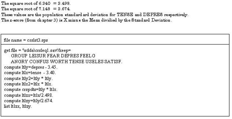
The data presented above
also demonstrates how curvilinearity can be assessed
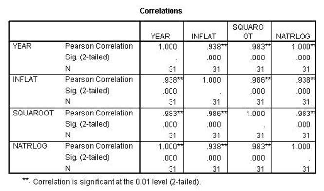
in a correlation or regression problem. The table below contains the
correlations of YEAR with INFLATION, INFLATION SQUARED, and the NATURAL LOG OF
INFLATION. It shows that when YEAR is correlated with inflation it is .938 but
when the Natural Log is computed the relationship becomes 1.00. This indicates
that there is a curvilinear relationship between INFLATION and YEAR.
Consequently, such a relationship can be tested (as was done here) by first
assessing a relationship between two variables and then computing the natural
log on the variable that is suspected of being curvilinear and testing that new
variable. If the correlation improves as in the example one can conclude that
there is a curvilinear relationship. (It must be determined that there is a
significant difference between the two correlations.) The curvilinear
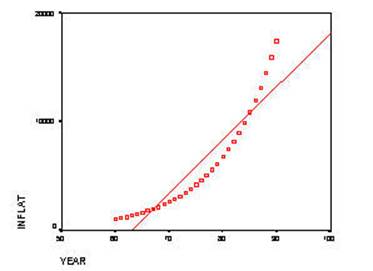
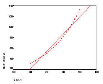
relationship is exemplified in the scattergrams
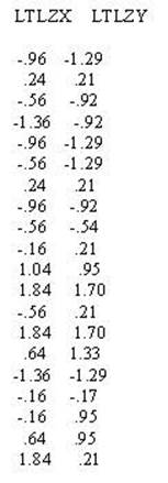
below.
![]()
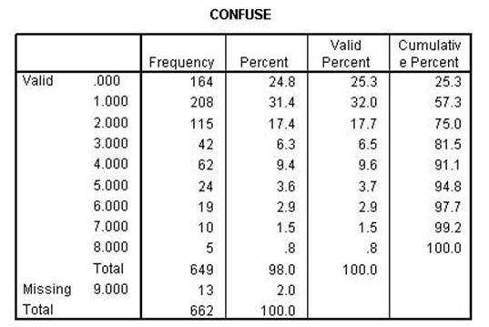
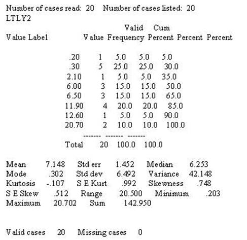
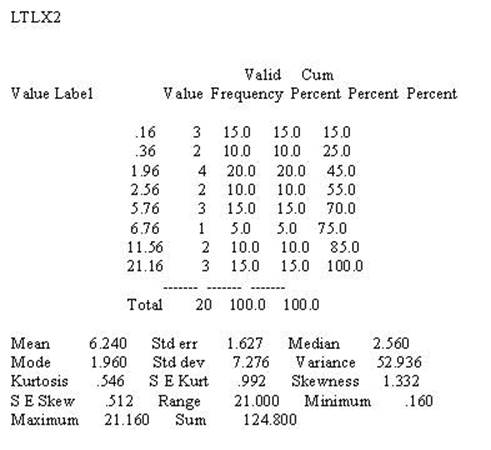
Skewness of
frequency data presents the problem as curvilinearity
data above and computing the Natural Log solves the problem in the same manner.
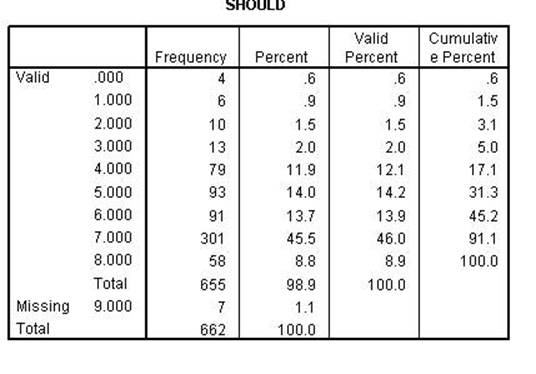
In this next example the variable SHOULD and CONFUSE are skewed. The reason for
the skewed data is that most feel that they do what they should and most people
don't feel confused. Consequently, most of the responses will be toward the end
of the scale.
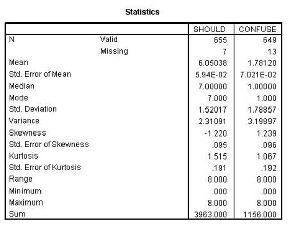
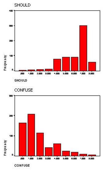
Both of the variables
are skewed (skewness greater than one). Further, the
SHOULD variable has another problem in that it is negatively skewed. The
computing the natural log function will correct skewness
only when it is positive. In order to correct the negative skewness
the item must first be reversed. The log function cannot be computed on 0
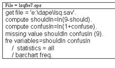
(zero) and 1 (one) must be added to all numbers. The syntax file above performs
all of the necessary functions.
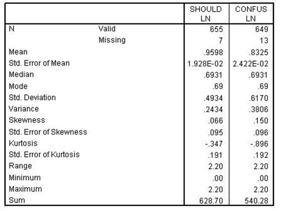
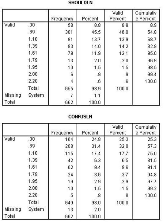
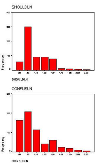
Notice that skewness has been corrected for both variables. Although it is not intuitive when comparing the bar charts.
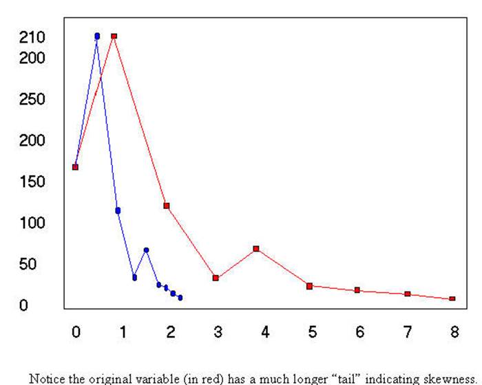
Consequently, the overlay chart has been drawn below to show the correction. In
the chart below both the original and natural log of the variable CONFUSE is plotted to show how the skewed variable has
become normal.
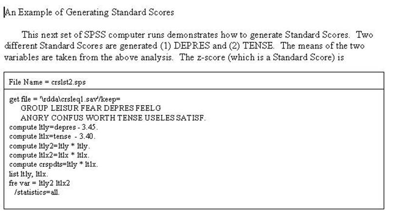
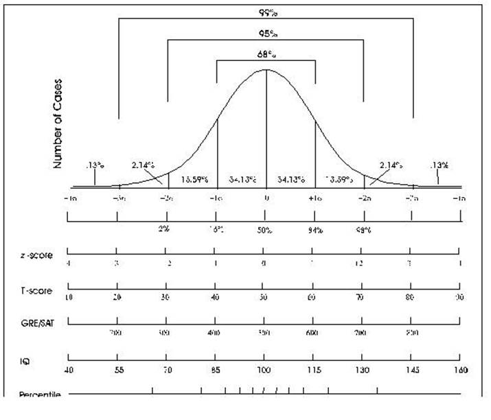
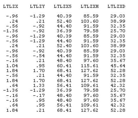
These are refered to as Standard Scores - they have a mean of 0 and a
standard deviation of 1. T-scores have a mean of 50 or 100 and a standard
deviation of 5 or 10. The WAIS has a mena of 100 and
a standard deviation of 15. The following jobstream
computes 3 different standard scores (1) the first has a mean of 50 and a
standard deviation of 10, (2) the second has a mean of 100 and a standard
deviation of 15, and the final (3) has a mean of 37 (possibly the average age
that people become depressed -- nobody says this has to make sense) and a
standard deviation of 8.3 (some other possibility). A little weird but you can
do anything you want as long as it does not have to make sense.